A series of posters I stumbled across while looking for something completely different. The brief, if I recall correctly was to create a spread about a specific typographer in their style. I managed to snag Tibor Kalman who was
(A) the most interesting person on the list.
(B) the only one that I'd actually heard of and
(C) unlikely to sue me for ripping off his artistic vision. ;)
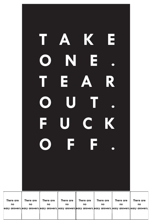
The first few posters are largly experiments although the "Take one and fuck off" was seriously considered for quite a while due to the themes of conflict/offense that run throughout his work.
I then moved onto using the braille version under the logic that once it was printed that sighted people wouldn't be able to read the text and blind people wouldn't be able to read the braille which would go a long way to creating contrast and conflict among the people trying to figure out the underlying message of it all. It would seem that some people just want to see the world burn.
The final spread is all about contrast, in that everything on it has an opposite and Conflict since Amnesty International and Isis are two groups who are born out of war yet it's difficult to think of anyone else who are more polar opposites.
(A) the most interesting person on the list.
(B) the only one that I'd actually heard of and
(C) unlikely to sue me for ripping off his artistic vision. ;)
The first few posters are largly experiments although the "Take one and fuck off" was seriously considered for quite a while due to the themes of conflict/offense that run throughout his work.
I then moved onto using the braille version under the logic that once it was printed that sighted people wouldn't be able to read the text and blind people wouldn't be able to read the braille which would go a long way to creating contrast and conflict among the people trying to figure out the underlying message of it all. It would seem that some people just want to see the world burn.
The final spread is all about contrast, in that everything on it has an opposite and Conflict since Amnesty International and Isis are two groups who are born out of war yet it's difficult to think of anyone else who are more polar opposites.